📊 Insights Data Reports
Last updated: February 26, 2026
Overview
71% of business meetings are considered unproductive. Meet Insights allows you to better understand how your team is investing their time. Below is an overview of the features inside of Insights.
- Dashboard - get a birds-eye view of all critical insights at your organization
- Schedule Meetings Insights - see scheduling trends over time by category, company, and pipeline view
- Members - see who are your top contributors
- Categories - see your top performing meeting categories
- Scheduling Links - see which meeting links at your company are getting the most action
Who Has Access to Insights?
For premium accounts
Anyone at your organization that is upgraded to have premium access will have access to insights. Free members will not have access.
For enterprise accounts
By default, anyone at your organization with an account can access insights. If you’d like to limit visibility to only Company Admins, please reach out to [support@goodtime.io](mailto:support@goodtime.io) to limit access.
Dashboard
Your Meetings Insights Dashboard serves as a birds-eye view to your company’s overall scheduling activity. You can drill into each of the components to see full reports as well as download information in CSV format.
Deep link: https://meet.goodtime.io/reports/dashboard
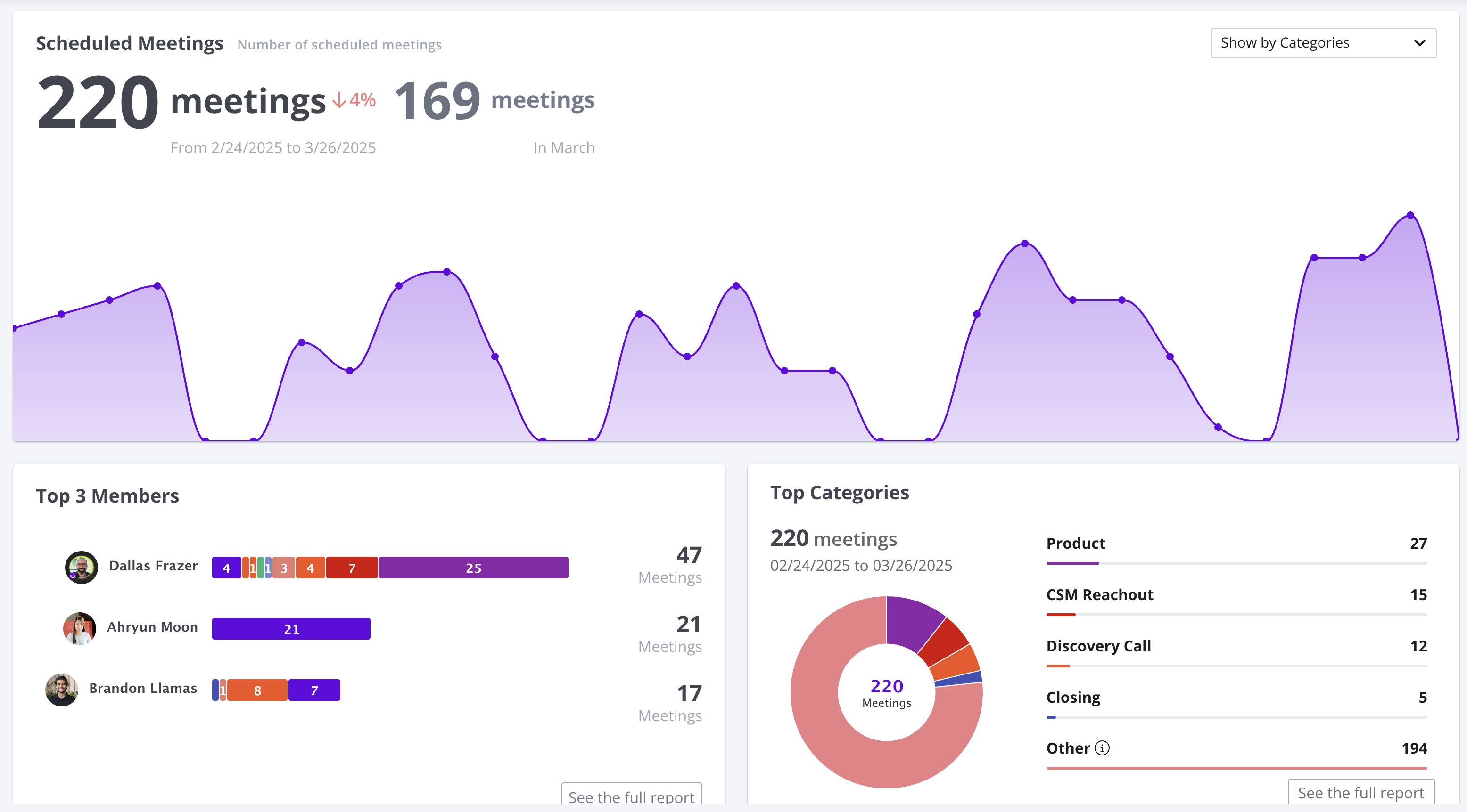
Components
- Scheduled Meetings - timeseries chart of the number of meetings that have been conducted over the selected period of time
- Top Members - the top three users at your organization that are scheduled for the most meetings via GoodTime Meet
- Top Categories - a pie chart breakdown of the top meeting categories utilized at your organization
- Top Scheduling Links - a leaderboard style list of the most actively utilized scheduling links
- Top Companies - the top 3 companies outside of your organization your team meets with
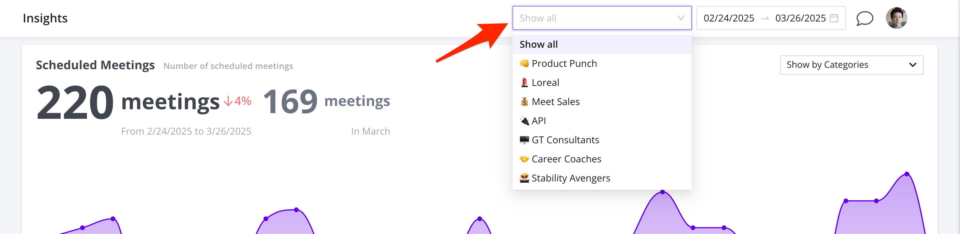
Filters
Standard Filters
- Date - Limit the range of data being pulled by the system
- Team Filters - quickly filter insights by teams
Report Specific Filters
- Categories - quickly filter by meeting category assigned to meetings
Insights Dashboards FAQs
How can I drill into a specific group’s scheduling information?
You can filter your Insights Dashboard by team by selecting a team from the dropdown in the top navigation bar (next to the dates filter). If you don’t see any teams there, you will need to create a team first.
NOTE: Data on a specific team will start collecting only after the team has been created. Data on specific teammates will only start collecting after the teammate has accepted their invitation to the team.
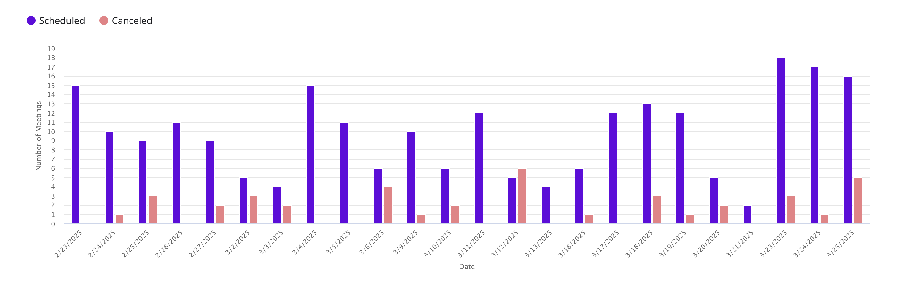
Scheduled Meetings
Scheduled Meetings Insights report allows you to dive deeper into the meetings that are scheduled at your company, primarily focusing on analyzing this information across time.
Deep Link: https://meet.goodtime.io/reports/scheduledMeetings
Headline Chart
The primary visualization at the top of the page shows the number of meetings created and canceled over a period of time broken down by day of meeting scheduled.
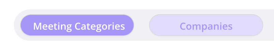
Tabular Data
The tabular data in the Scheduled Meetings report is a pivot table of meeting scheduled by Meeting Category or Company (external company meeting is scheduled) with with column representing the dates and the values in each row/column pair the number of meetings scheduled on that date. Using the Tabs at the top, you can view the tabular data with the primary access of Meeting Categories or Companies.
PRO TIP: Sales and customer success teams can use this information to determine how often touch points are occurring across their Meeting Categories or with Companies. Healthy engagement will show as evenly paced meetings across the window of engagement with the prospect or customer.
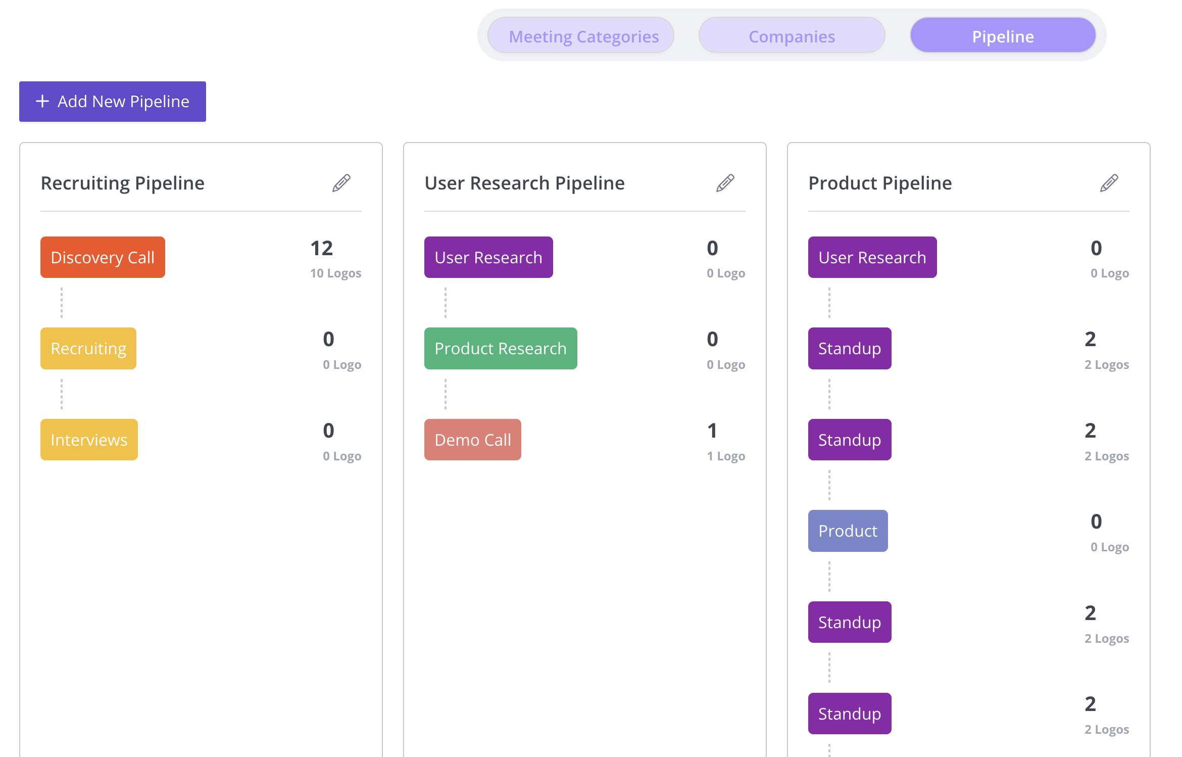
Pipeline View
Configuring meeting categories can be powerful in multiple ways. The pipeline view allows users to create meeting pipelines based on categories and see the flow of meetings as they pass through the created pipelines.
PRO TIP: The pipeline view is a very flexible way to track progress through a process funnel. For example, when recruiters use GoodTime to schedule initial screens to hiring manager calls, they can create a short pipeline to see the candidate flow between the different steps of the recruiting funnel.
Available Filters
Standard Filters
- Date - Limit the range of data being pulled by the system
- Team Filters - quickly filter insights by teams
Report Specific Filters
- Categories - group table data by meeting category assigned to meetings
- Companies - group table data by external companies your teammates are meeting with
Members
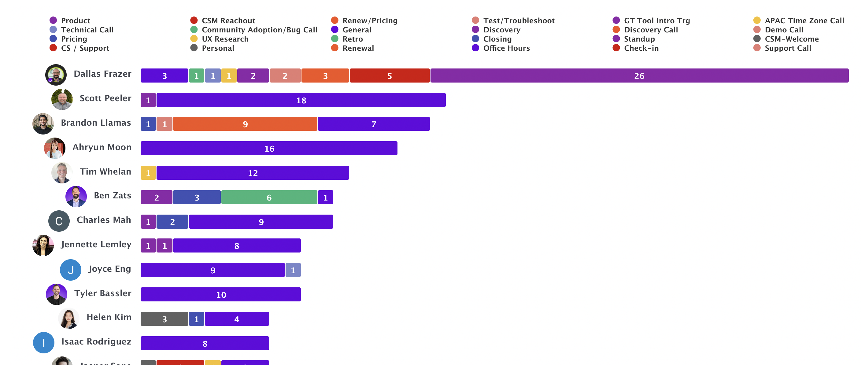
Horizontal Bar Chart
The visual Members Horizontal Bar Chart is a graphical leaderboard and quickly helps identify scale and distribution of meetings by team or group. It is most powerful when used in conjunction with Team Filters as well as Meeting Categories. At a quick glance, you can evaluate workload distribution as well as understand differences in how time is managed by different teammates.
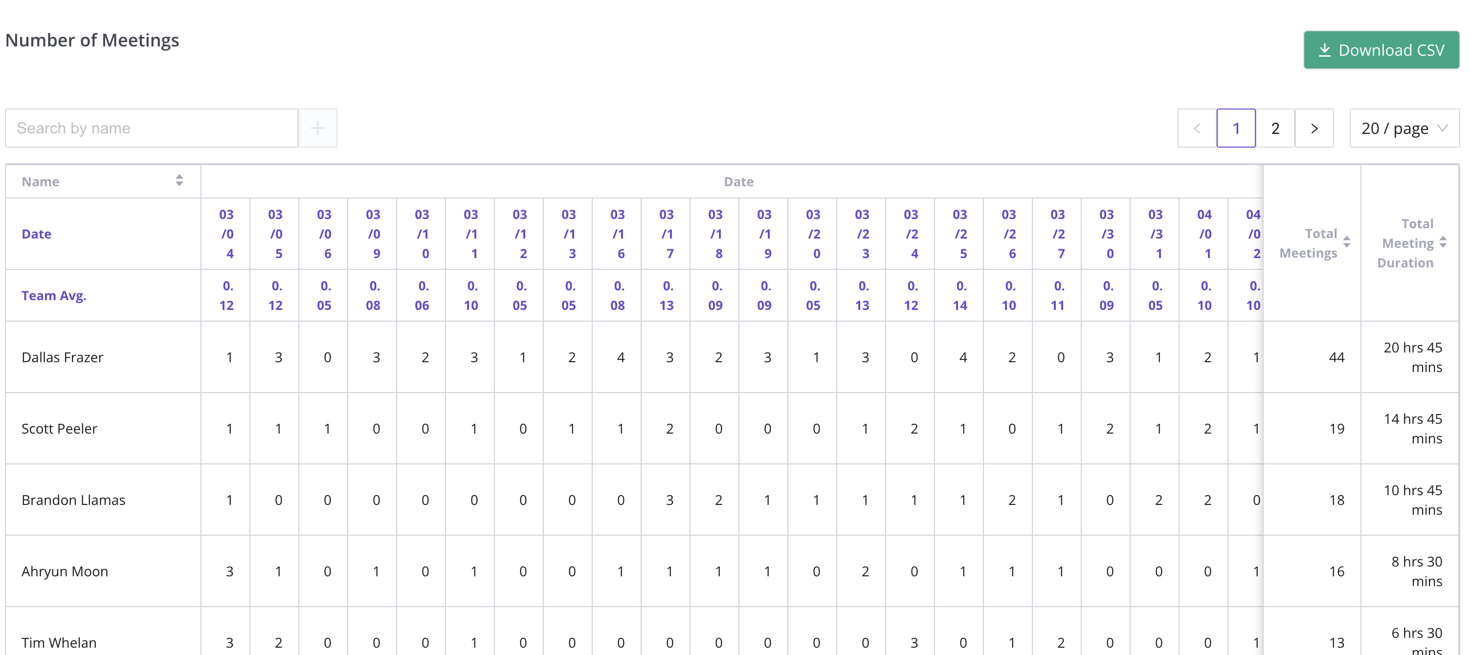
Tabular View
The Members Tabular View helps identify meeting loads of individuals on your team and the distribution of those meetings across a fixed period of time. It also provides total meeting duration to understand the time commitment of meetings by teammate.
Available Filters
Standard Filters
- Date - Limit the range of data being pulled by the system
- Team Filters - quickly filter insights by teams
Report Specific Filters
- Search - search by name on within the Tabular View
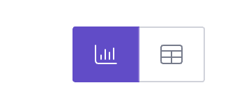
PRO TIP: To switch between the two views, press the tabs in the top right hand corner, the first icon is for Horizontal Bar Graph View and the second one is for Tabular View.
PRO TIP: To download meeting specific data: The members tab is designed to allow you to help analyze time commitments but is not intended to be utilized to drill into specific meeting content. You can download meeting totals utilizing the “Download CSV” button on the tabular view.